Content of the article

In the world of online marketing, the most important step is to help the user make the first move towards a particular product. Calls to action (CTA) do just that: they unobtrusively guide visitors from getting to know the brand to making a purchase or request.
In this article, we will analyze the key types of CTA, psychological techniques, and the impact of a successful combination of design and text on user decisions, as well as how to measure and constantly improve calls to action. These practical tips will help you not only get more clicks but also turn them into real customers and increase your company’s revenue.
What is a Call to Action (CTA)?
A Call to Action (CTA) is an interactive interface element that encourages the user to take a specific action. Since the very first textual calls to action «Click here», CTA design has undergone significant transformations: colored buttons with micro-animation, personalized blocks for the needs of different audience segments, and integrated contact collection forms have appeared.
Types of CTA
There are several basic formats of CTA on the modern web, each of which is suitable for certain tasks and contexts:
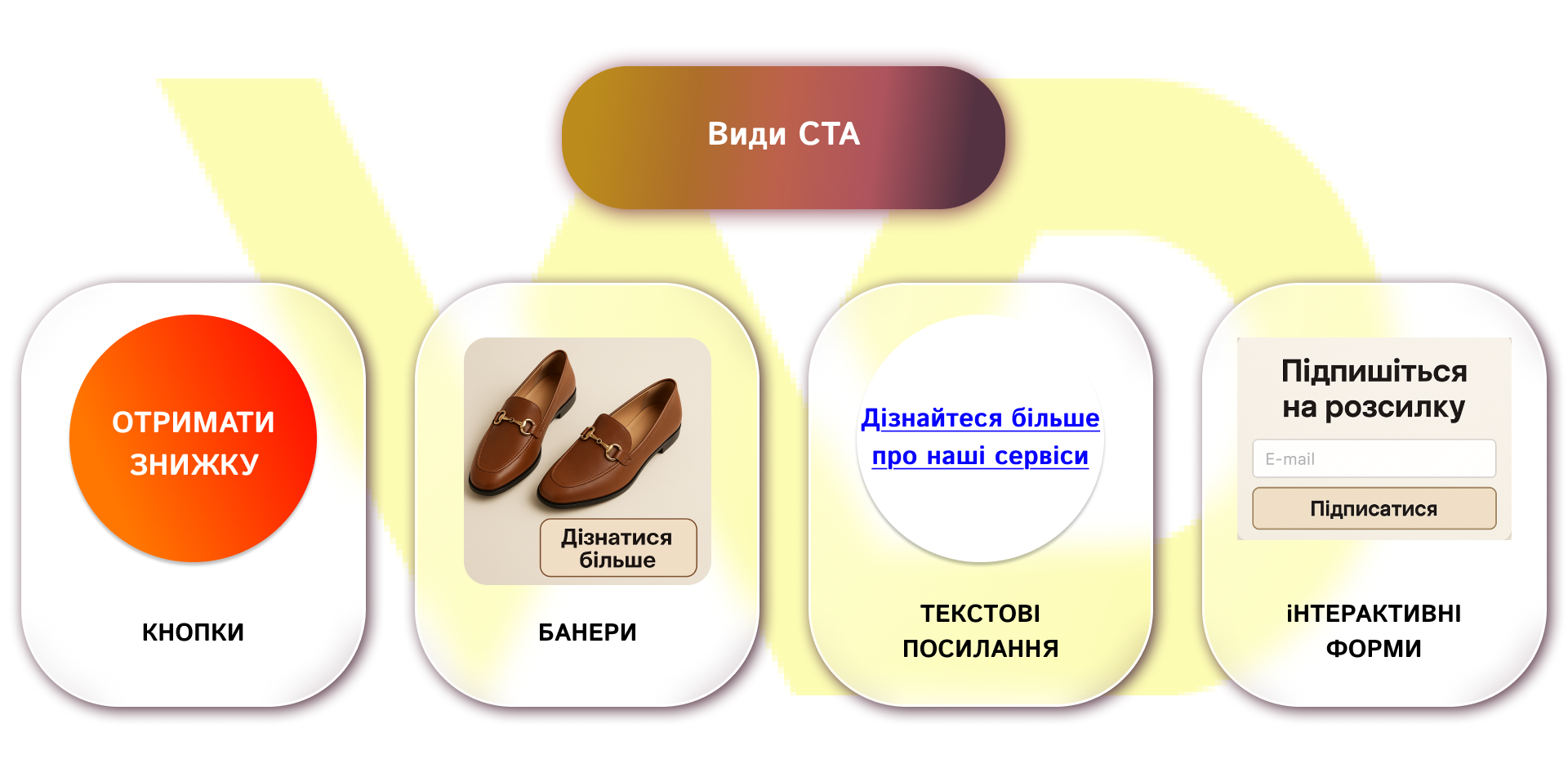
Buttons
The most common CTA format is a button with clear imperative or infinitive text. They stand out well on the page due to their contrasting design and clear placement. Buttons are used for direct targeted actions:
- «Buy» in online stores to redirect to the shopping cart or checkout;
- «Get a discount» – during promotions and sales, often accompanied by a countdown timer;
- «Register» – on landing pages or in loyalty programs.
It is worth choosing short texts for CTA buttons (1-3 words) so that the user clearly understands what will happen after clicking.
Banners
Banner units combine an image, a headline, and a CTA button or text link. Such elements work well in ad units on websites and in email newsletters, where you need to maximize interest and convey a visual message:
- product presentation – a banner with a photo of the product + «Learn more» button;
- promo campaign – graphics with discount conditions + CTA «Get a coupon».
For the best effect, you should not overload the banner with text – put the main information in the headline, and make the call to action concise.
Text links
These are phrases embedded in the content with an active link. They are less intrusive than buttons, but are effective in articles, blogs, and long texts where the user naturally reads and may be interested in taking an additional action. For example:
- The text «Learn more about our services» contains a link to a page with a detailed offer;
- «Download a free guide» with a link in the text of an instruction or review.
Visually, such CTA should be highlighted with color or underlining. It is also important to avoid redundancy – 1-2 such links per 500 words are optimal.
Interactive forms
These are elements embedded on the page that collect contact information or automatically start the interaction process without going to another page. It can be
- a newsletter subscription form with E-mail fields and a «Subscribe» button;
- request for demo access or consultation through a popup or built-in widget;
- a chatbot that immediately offers help with CTA buttons («I want a consultation», «Calculate the cost»).
For users to respond to these CTA, you should reduce the number of fields to a minimum (name and e-mail) and add a brief description of the benefits of filling out the form.
After you’ve familiarized yourself with the basic formats of calls to action, you need to understand why a well-chosen and well-designed CTA plays a critical role in the success of your business. After all, each of the types in question can become a powerful tool only if properly integrated into the overall conversion strategy. The next section will show how an effective CTA affects the sales funnel and brings real benefits to the company.
Why CTA is important for business
A well-designed call to action is a bridge between a user’s desire and their actual action. In a standard sales funnel (AIDA (Awareness → Interest → Decision → Action)), at each stage, the outflow of visitors can be from 20% to 40% in the absence of clear guidelines for where to go next.
An effective CTA guides the user along a clearly defined path: after reading the product description, the visitor intuitively understands that the next step is «Add to cart» or «Request a call». In addition, well-formulated text and a well-thought-out button design significantly reduce cognitive load, because the user does not have to think for a long time about what to do next. And combining the call to action with warranty messages, such as «Free Shipping» or «Return within 14 Days», further increases the level of trust and confidence. As a result, the overall conversion rate increases at all stages of the sales funnel.
Examples of successful cases of Ukrainian brands
The Ukrainian clothing brand MustHave integrated informers (mini-widgets) into its website, which appeared at key points of interaction with products. For example, widgets appeared in the cards of skirts and jeans presented in different lengths, allowing users to quickly navigate to the desired page. Informants also reported on the terms of promotions, changes in payment, or product availability. As a result:
- Bounce Rate (bounce rate) decreased by 6.4%;
- the number of page visits increased by 10.2%;
- unique views increased by 12.6%.
On the Foxtrot website, marketers implemented a special night informer that was activated exclusively during the night sale (from 18:00 to 9:00) and encouraged users to use a promotional code. This tactic helped to increase the widget’s CTR by 4 times compared to traditional banners and buttons.
Both examples confirm that even a small but timely CTA widget with a relevant message can bring engagement and sales to a new level.
International practices
HubSpot has proven the effectiveness of smart CTA that automatically change the text and offer depending on the user’s status in the database (new visitor, subscriber, or customer). Thanks to such dynamic calls, the company managed to increase the click-through rate (CTR) in email campaigns by 14% and in the web interface by 10%.
Netflix has made its main call to action unambiguous: the service’s homepage is free of all other distractions, and one big red CTA «Try 30 Days Free» leads all visitors to subscribe, simplifying the decision-making process.
Dropbox, on the other hand, leaves only minimal text and a single green CTA «Sign up for free» on a white background to emphasize the value of a free start and reduce entry barriers. This concise strategy led to an 8.18% increase in new signups in 2023.
These cases show that regardless of the size of the business or the communication channel, a properly customized and designed CTA can significantly improve key performance indicators, from subscriptions to direct sales.
Psychological aspects of an effective CTA
A good call to action works not only through text and color – it activates psychological triggers that push the user to a specific decision. Emotions, cognitive habits, and attention spans all influence the result. In this section, we’ll look at the key principles that help make a CTA truly compelling.
4U principles: the psychology of influence in CTA text
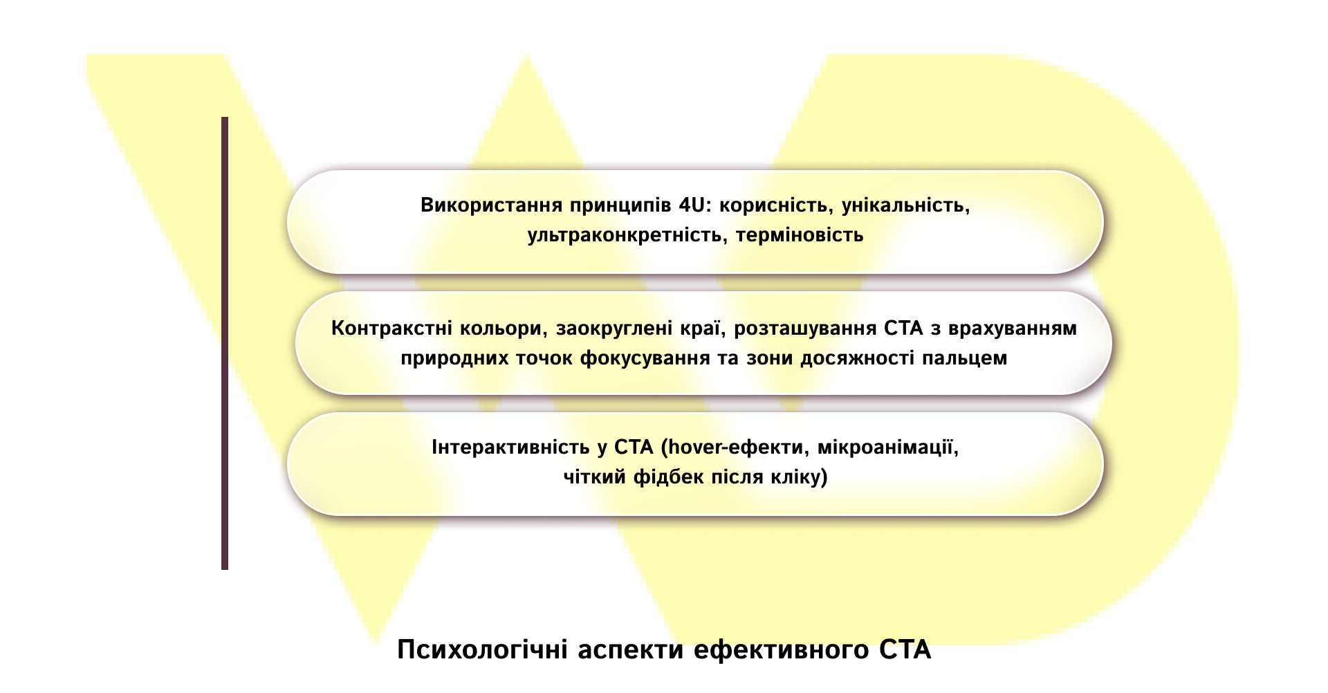
One of the most popular frameworks in marketing is 4U (Usefulness, Uniqueness, Ultra-specificity, Urgency). Its essence lies in the activation of four triggers that arouse interest, trust, and a desire to act immediately.
- Usefulness: The CTA should show what specific benefit the user gets. The phrase «Download a free checklist» works better than «Click here» because it immediately explains what a person will get.
- Uniqueness: the call to action should demonstrate that the specific offer is not typical. For example, instead of «Read the article» write: «Get exclusive instructions from our experts». This creates a value effect that should not be lost.
- Ultra-specificity: clarifications increase trust. «Get 5 email templates» sounds more specific than «Get materials». People want to know exactly what they will receive and how much.
- Urgency: the psychological effect of time constraints encourages a quick response. CTAs such as «Discount valid until July 15» or «Last 10 seats» activate the fear of missing out (FOMO), which significantly increases click-through rates.
Thus, calls that appeal to the urgency or limited resource increase conversion compared to standard options.
Color, shape, and location: how to not only see but also click
CTA design directly affects the perception and likelihood of action. Users make decisions in seconds, and this process is largely visual.
Color contrast is one of the most powerful visual triggers in CTAs. In HubSpot‘s classic A/B test, the red «Sign up» button demonstrated a 21% higher conversion rate than the green one, simply due to better visual contrast against a light background. At the same time, the chosen shade should fit into the overall style of the brand: bright warm colors like orange, red, or green work well on a white or neutral background, but you should always make sure that they do not conflict with other design elements.
The shape of the button is equally important. Rounded edges are perceived as «friendly» and safe. Soft contours reduce subconscious resistance to pressing, while sharp corners can be associated with aggression or risk.
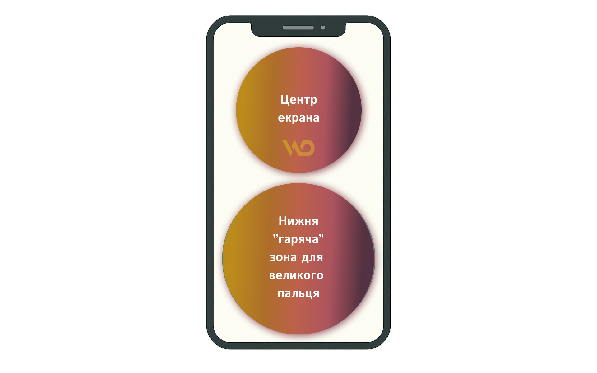
The location of the CTA should take into account the natural points of focus and the areas of reach with a finger. On a desktop, users most often pay attention to the center of the screen and the top third of the page, while on mobile devices, the center of the screen and the lower area where the thumb reaches the screen most comfortably are considered «hot zones». According to Nielsen Norman Group recommendations, the minimum size of touch elements should be at least 1×1 cm for accurate tapping. And the research by Steven Hoober and Smashing Magazine elaborates on the «thumb zones» because placing interface elements in these areas increases the likelihood of interaction by 23-35%.
Micro-animations and hover effects: how to make the user «subconsciously» click
Interactivity in CTA creates the effect of live interaction. Even a small animation or element reaction to user actions can significantly increase the chances of a click.
- Hover effects: when you hover the mouse, the button can change color, get a shadow, «step forward» or smoothly enlarge. This creates a presence effect and suggests that there is an active area.
- Micro-animations: for example, a slight «pulsation» of a button or backlighting while scrolling. Such elements attract attention but do not distract – they remain in the peripheral perception zone.
- Clear feedback: after a click, it is advisable to immediately show confirmation of the action: changing the button to «Done», «Thank you!» or a pop-up message with the result. This creates a sense of control and completion.
According to a publication on UX Planet, well-designed micro-interactions can increase the overall level of user engagement by up to 35%.
A successful CTA is a synthesis of text, design, and psychology. If each of these elements works not separately, but as part of a holistic experience, the chance of converting a user into a customer increases significantly.
Common mistakes in CTA
Even the most creative call to action can lose its effectiveness due to common mistakes in the approach. Below are the key ones that should be eliminated to make your CTA work at its best.
- Excessive number of calls to action.
When more than one or two CTA are placed on a page – «Buy», «Subscribe», «Get a discount», etc. – the user’s attention is scattered, and they are looking for a long time where to click. This causes «choice fatigue» and increases the bounce rate. Limiting the number of pop-ups and CTAs to a minimum can increase conversion rates.
- Pop-ups at the wrong time.
An automatic pop-up immediately after entering the site is perceived as aggressive marketing and annoys the visitor. Instead, you should use behavioral triggers:
- displaying a pop-up after viewing a certain part of the content (for example, 50% of the page);
- use of exit-intent technology, which is activated when a user tries to close a tab.
- Deceptive wording and violation of expectations.
If a CTA promises free content or service, but after clicking, the user is faced with hidden conditions (paid subscription, etc.), this undermines brand trust. Unauthorized «surprises» cause a negative experience and reduce the likelihood of repeat conversions. To avoid this, you should always clearly state all the terms and conditions, avoid additional steps after the click without warning, and fulfill the promises made in the CTA.
By fixing these key shortcomings, businesses improve user experience and pave the way for further growth. That’s why measuring and optimizing CTAs is the next logical step: only through systematic data analysis and regular A/B testing can you get a clear understanding of what works best and continuously increase conversions.
Measurement and optimization of CTA
To ensure that your CTA not only work the same, but become more and more effective, it’s important not only to implement best practices, but also to regularly analyze their results and make improvements.
CTA performance statistics
In real life, the data can be surprising: for example, HubSpot found that personalized CTA, where the button addresses the user by name or offers the exact product they were viewing, convert 202% better than basic CTA.
Another example demonstrates how important the space around the button is: VWO found that CTAs surrounded by a minimum of visual noise and enough white space increase conversions by 232%. This result can be found in the PublicNow publication.
Key metrics
Three key metrics should be tracked after each stage of working with CTAs.
- CTR (Click-Through Rate) – the ratio of the number of clicks to the total number of CTA impressions; it shows how attractive the call to action is to the user at first glance.
- CR (Conversion Rate) – the ratio of targeted actions (for example, filling out a form or making a purchase) to the total number of visitors who saw the CTA; this indicator illustrates how well your users’ actions lead to the desired result.
- ROI (Return on Investment) – the ratio of the income received from the CTA to the costs of its creation and promotion; it helps to assess how justified the investment in the design and testing of the call to action was.
Regular monitoring of key metrics ensures that CTAs not only look good but also bring the expected business results.
A/B testing and optimization methods
A/B testing remains the most effective method of finding the best CTA variant. First, two designs are compared for several weeks: for example, a blue button measuring 150×50 px with the inscription «Reserve» and an orange 180×60 px button with the text «Book a seat». If the orange variant demonstrates at least 5% higher CTR, it is recommended to consider it as the prevailing one and continue testing the following parameters – text, location, etc. Consistent and methodical testing of each CTA element allows you to achieve maximum conversion without unnecessary assumptions.
Analytics tools
Proven solutions are suitable for collecting and analyzing data.
- Google Analytics will help you track events (button clicks) and set goals (registrations, purchases).
- Hotjar allows you to see click heatmaps and user session records to understand whether they notice your CTAs and where else they click.
- Crazy Egg gives you a quick way to run A/B tests and visualize hot spots on your pages.
Together, these tools give you a holistic view of what’s working and what needs to be improved, helping you take your CTAs to the next level.
Step-by-step checklist for creating an effective CTA
For your convenience, here is a checklist that will help you systematize your work on calls to action. It covers all the key stages – from defining the goal and selecting the format to optimizing the design and regularly analyzing the results.
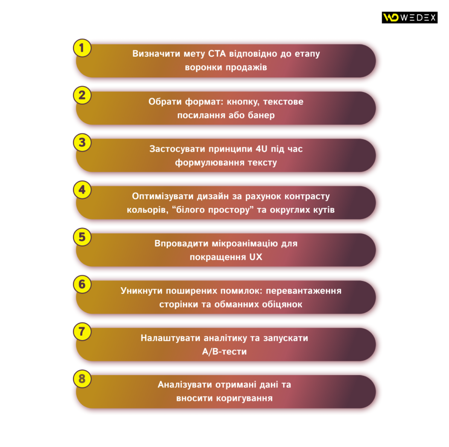
By following this algorithm when creating CTA, you can be sure that calls to action will work to increase conversions and company profits.
Looking to the future: voice and AI CTA
With the rapid development of voice assistants and artificial intelligence, CTA are moving beyond classic buttons and banners to become interactive and contextually relevant.
Today, more and more services are integrating with Alexa, Siri, and Google Assistant voice assistants, allowing users to perform actions without pressing buttons. For example, a pizza or coffee order can be placed simply by using the voice command: «Alexa, order my favorite pizza» or «Siri, add a latte to the cart». Such voice calls to action reduce barriers to entry and speed up the path from desire to purchase, especially when the user is busy with other things.
No less relevant are the changes in the emergence of chatbots. These assistants are based on large language models and now not only answer questions but also actively suggest next steps. After analyzing the user’s behavior and preferences, the bot can recommend «Book a consultation», «Get a personalized offer», or even «Schedule delivery for tomorrow». Thanks to a flexible text generator, CTA look natural and avoid intrusiveness.
Real-time contextual personalization has also gained popularity. AI systems analyze user data, previous actions, location, and time of day to provide the most relevant CTA. For example, a visitor reading an article about hiking equipment in the evening may be offered «Get the winter catalog» with a limited-time discount, and those who were interested in offline events may be offered «Register for a webinar today».
Mobile apps also integrate mini-assistants that offer CTA in user scenarios: for example, in a fitness app, after analyzing a workout, a button appears to «Get a recovery plan» or «Book a lesson with a trainer». Each such appeal is based on AI logic and takes into account individual needs to the maximum extent possible.
Thus, the future of CTA is not only visual elements but also omnichannel, smart, and personalized interactions that provide an instant and natural transition of the user to the target action.





 16/09/2025
  1709
1709


