
 05/01/2023
  4082
4082

Інтернет-маркетинг
простою мовою
Content of the article
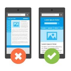
How to make a website mobile-friendly?
In recent years, Google has consistently switched to mobile-first site indexing, i.e. Googlebot indexes the mobile version of your web resource. If there is a non-optimized mobile version, the desktop version will also not have high positions in the search.
What is mobile optimization?
Mobile SEO is optimization of the website for mobile search engines, that is, optimization for visitors who use mobile devices, tablets, smartphones, etc. to access your resource. The goal of mobile search engine optimization is the convenience of using the site for mobile visitors, regardless of the operating system of the device, the size or resolution of the screen or the speed of the Internet connection.
Why is it so important to make your site mobile-friendly?
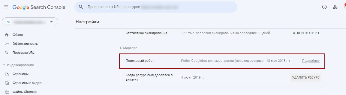
Web resource owners should understand that a site that is not optimized for mobile users will lose visitors along with ranking in search engines. Since 2015 when Google launched updates for mobile devices, it consistently gives priority to mobile search – mobile-first index. To date, more than 70% of resources are involved in the mobile-first index, you can check your site in Google Search Console – “Settings -> Search robot”
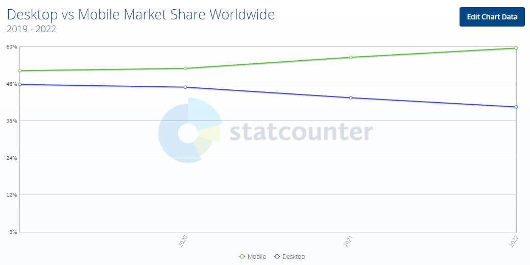
Almost 60% of searches in 2022 are carried out from mobile devices and this trend will only increase.
How to choose a mobile solution for the site?
- The mobile version of the site uses separate URLs or a separate subdomain for the mobile version of the pages (site.com/mobile/page-n, m.site.com/page-n). Most likely, this is a shortened version of the main site with limited functionality. It offers a more mobile-friendly navigation and contains less content than the desktop one. This configuration is not as popular as before and not recommended by Google.
- A mobile site application is an application for the appropriate mobile platform (iOS, Android), which can complement the site or be an independent solution. The development and use of a mobile application is not appropriate for every site (business). For an e-commerce site or delivery service, a mobile app can improve the user experience for mobile visits. For an information site, the development and use of a mobile application will not be the optimal solution.
- Responsive design of the site – automatically adapts to the parameters of the device from which the login is made. With this configuration, the server responds with different HTML (and CSS) to the same URL depending on which user agent is requesting the page (mobile, tablet, or desktop).
In conclusion, Google and other search engines recommend that you use a responsive layout for your mobile site today. At the same time, it is necessary to take into account three main components:
- CSS optimization and media query customization;
- adjustment of the viewing area using special metatags;
- optimization of used plugins.
How to check if your site is optimized for mobile devices?
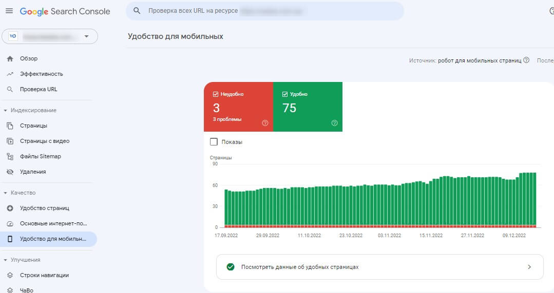
Check out common mobile issues with help Google Search Console on the “Mobile Friendly” tab
You can also check your site’s mobile optimization using Google Mobile-Friendly Test

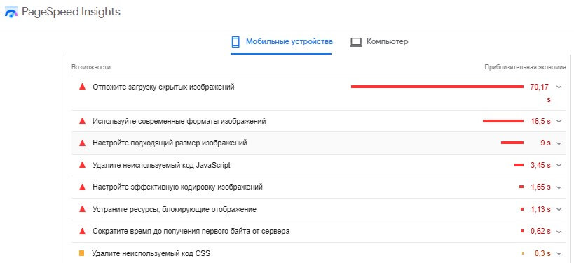
Check page speed on mobile. you can use Google PageSpeed Insights, enter the URL of the page you want to check and wait for the analysis to complete. Scroll down to the “Features” section and check out the suggestions to help improve your site’s speed.
How to make your site mobile?
What should you pay attention to in order to make the site convenient for users of mobile devices and for search engines?
Optimizing load times for mobile users
The loading speed of your site on mobile devices is crucial if you want to improve your mobile SEO:
- Check your server’s response time
- Avoid Flash – use HTML5 instead
- Don’t use too many plugins
- Make your images mobile-friendly
- Enable web caching
- Sign up for a CDN content delivery network
- Check your HTML, CSS, and JavaScript code
- Use fewer redirects
Allow Google to crawl everything – Check your robots.txt file for blocking Javascript, CSS, images, and other important parts of your site’s code for desktop and mobile.
Work on the UI and UX of your mobile site
Use the Mind Viewport Meta Tag Wisely – The Viewport Content tag tells browsers how to handle the size and scale of your web page on different devices.
Improve readability – use simple clear fonts with a size of at least 14 pixels. Make sure there is enough contrast between the text and the background to avoid legibility issues in challenging environments.
Use a “thumb-friendly” approach – Google recommends a minimum touch target size of around 7mm or 48 CSS pixels with a minimum spacing of at least 8 pixels.
Improve Mobile Navigation – Your site’s mobile navigation can take many forms, but you should always remember that it should be natural and intuitive for users.
Watch for calls-to-action (CTAs) – Always place calls-to-action on your landing pages at the top of the page for mobile users, never let non-important banners overlap the CTAs.
Test Social Media Buttons – Use social media buttons on the mobile version of your site by using a tabbed view and placing widgets, say at the bottom of the page.
Avoid obtrusive pop-up windows – with smaller screen sizes on mobile devices, a pop-up window can interfere with viewing the target content and may not look exactly the way you want. Any pop-up windows should be treated responsibly and ensure that they do not completely hide the background content.
Implement Schema markup
Sites with properly structured schema markup are better interpreted by Google and usually rank high in Google search results.
Since we all live in a mobile-centric world, mobile SEO is absolutely essential these days. Although it doesn’t require a lot of time and effort, the benefits of mobile SEO are huge and include a better user experience on mobile devices, higher rankings and conversions.

commercial offer
Other articles by the author

03/09/2025
Without a well-thought-out link building strategy, including proper submission to directories, even the best content will not be able to break into the top search results, and chaotic backlinks can lead to penalties from Google.

06/11/2024
Target audience analysis is a key stage in the development of any business that allows you to better understand your customers and effectively set up marketing strategies. This process allows you to segment the audience by various criteria and identify their needs, which helps to increase sales and attract loyal customers.

02/07/2024
Google Search Console, also known as GSC, is a free service from Google that allows website owners to monitor the overall health and performance of their sites using data directly from Google.
Latest articles by #SEO

23/07/2026
An RSS feed is a separate file containing a list of a website's latest posts. When a new article, news item, or other content appears on the site, information about it is automatically added to this feed.

08/07/2026
Donor analysis isn't about examining a single metric; it's about comparing several metrics against one another.

29/06/2026
If you analyze search queries correctly, you can better understand your audience, design a more precise website structure, create relevant content, and improve your SEO results without unnecessary expenses.