Content of the article
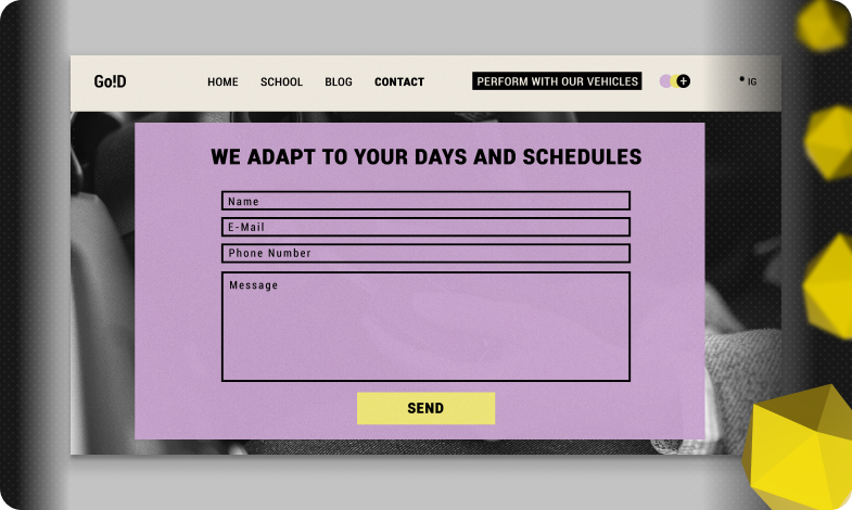
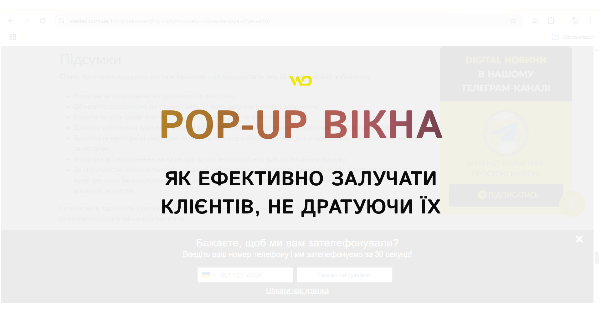
In today’s fiercely competitive environment, businesses need to keep the attention of website visitors and turn them into customers. One of the most popular tools for this is pop-ups. When used correctly, they help to increase conversions and can be more effective than regular banners, but incorrectly configured pop-ups annoy users.
In this article, we’ll look at the basic principles of working with pop-up windows: their types and main elements, recommendations for design and display conditions, examples of popular services for creating them.
What is a pop-up window?
A pop-up window is an interactive element on a web page that automatically appears on top of the main content and attracts the user’s attention. As a rule, it is triggered after a certain action by the visitor, such as a click or scroll, or after a set time after the page has loaded. A pop-up can be
- modal – blocking further interaction with the site until the user closes it;
- non-modal – easily minimized and allowing you to continue browsing.
Unlike pop-up banners, a pop-up form cannot be ignored. It either prompts you to immediately perform the target action (subscribe, download a file, take advantage of a discount) or close it before continuing to browse the site.
Benefits of using pop-up windows
Pop-up windows are not just an aggressive advertising tool, but a powerful means of communication with visitors if they are customized to meet the needs of the audience and the logic of their behavior on the site.
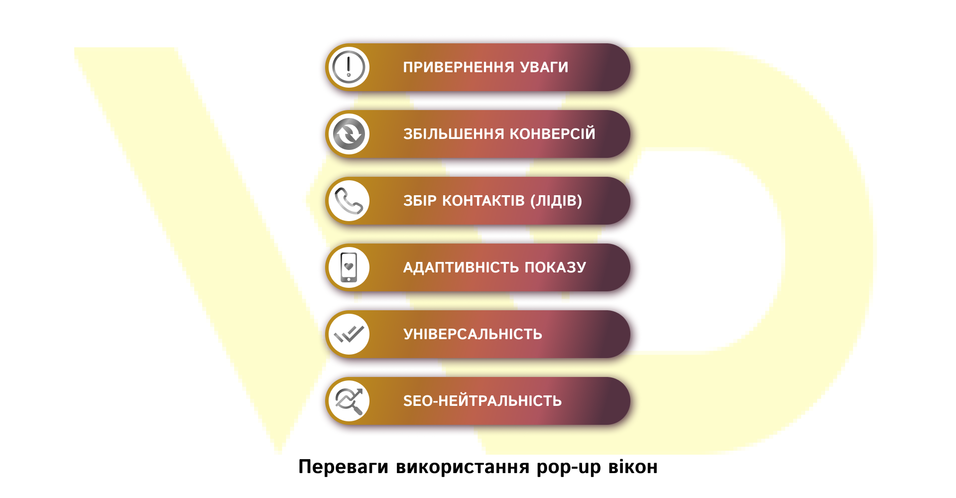
Let’s take a look at the key advantages of using pop-ups and find out how each of them works for your business.
Attracting attention
A pop-up instantly appears on top of the main content, which allows you to immediately convey important information – a promotional offer, an urgent announcement, or a favorable discount – at the moment when the visitor has just entered the site. This gives you maximum visibility of your message, which is especially useful for short-term campaigns or seasonal sales.
Increase conversions
Even according to conservative estimates, properly configured pop-ups can generate 3% of new leads and more. Neil Patel’s research shows that the average conversion rate of a pop-up is 3-5%, and according to OptiMonk, about 11% of site visitors leave contact information or make a purchase after interacting with the form. So, if your site is visited by 1,000 people every month, a pop-up will help you get an additional 30-110 potential customers who would otherwise leave without interaction.
Collecting contacts (leads)
Pop-ups are one of the most effective ways to quickly expand your email marketing database. According to Plerdy, 54% of users are willing to leave their email address in exchange for a useful bonus: a free checklist, manual, or promo code. By integrating a pop-up with the offer «Subscribe to the newsletter and get a PDF with tips,» you get high-quality confirmed leads that you can follow up with via email campaigns or personalized offers.
Adaptive display
Flexible trigger settings allow you to show pop-ups at the most relevant moment: a specified time after the page loads, after viewing a certain part of the content, or when users are about to leave the site. Such targeting increases efficiency – the message appears when the user is already interested and ready to interact, and not in the first seconds of familiarization with the site, when the offer may seem intrusive.
Versatility
Pop-ups are suitable for any business task: they help to collect feedback and conduct surveys, announce new products and promotions, invite to webinars, or demonstrate important messages. B2C stores and B2B companies alike find them a useful tool for lead generation and customer loyalty. Thanks to the ability to segment and personalize messages, you can set up separate pop-ups for different audience groups, increasing their relevance and effectiveness.
SEO neutrality
Properly implemented pop-ups do not harm the website’s ranking in search engines. They should be easy to close, correctly adapted to mobile screens, and not interfere with access to the main content. In this case, Google does not apply penalties, and you can interact with your audience through pop-ups without the risk of losing positions in the search results.
By integrating pop-ups into the logic of audience interaction, you will get an effective tool that will work for your business 24/7.
Types of pop-up forms
Different scenarios of interaction with the visitor require different pop-up formats to achieve maximum efficiency without unnecessary intrusion. Let’s take a look at the most common types of pop-up forms.
- Welcome (entry) window. It is displayed immediately after the page loads. This is a full-screen form that covers the entire screen. Welcome pop-ups are ideal for the first contact with a new visitor – , for example, offering a promotional code or a gift during registration. Thanks to the full screen and bright design, they are guaranteed to attract attention. However, too many pop-ups can be annoying, so they are usually displayed no more than once per session.
- Timed pop-up. It appears a few seconds after the user visits the site. This approach gives the visitor time to familiarize himself with the content before offering an action. For example, a form can be displayed after 5-10 seconds of visiting. Timed pop-ups are considered less aggressive and often give a better response, because the user already understands what the site is about and is ready to interact with the offer.
- Scroll pop-up. Pops up when the user scrolls the page to a certain place (for example, after 50% of the view). This type allows you to show a message at the most convenient moment: when the visitor has already read the main material. Such forms are often used to offer a subscription to a newsletter or a bonus after reading the product.
- A window when trying to exit (exit-intent). It is activated when the algorithm determines the user’s intention to leave the site (for example, the cursor moves to the address bar). It is like a last attempt to retain the customer: a pop-up can offer a discount, free consultation, or other bonus. According to Conversion Sciences, a well-crafted exit-intent pop-up can return 10-15% of those users who were planning to leave the site. That is, a valuable offer at the last moment often works effectively.
- Pop-up after action (click pop-up). It pops up only after the user initiates an action, for example, by clicking on a button or link. This format is considered the friendliest, as the user sees the form only when he or she wants it. For example, after clicking on «Learn more», a pop-up with a detailed description appears, which works unobtrusively. Click pop-ups are great for visitors who have already shown interest and can receive additional content of their choice.
Please note! It is not necessary to implement all types at once. Start with one or two forms, test the effectiveness, and only then expand the range of pop-ups. Excessive pop-ups can be annoying, so introduce new formats gradually, tracking audience reaction and conversions. This approach ensures that each type of pop-up works as efficiently as possible without compromising the user experience.
The main elements of pop-up forms
A properly designed pop-up window consists of several basic blocks:
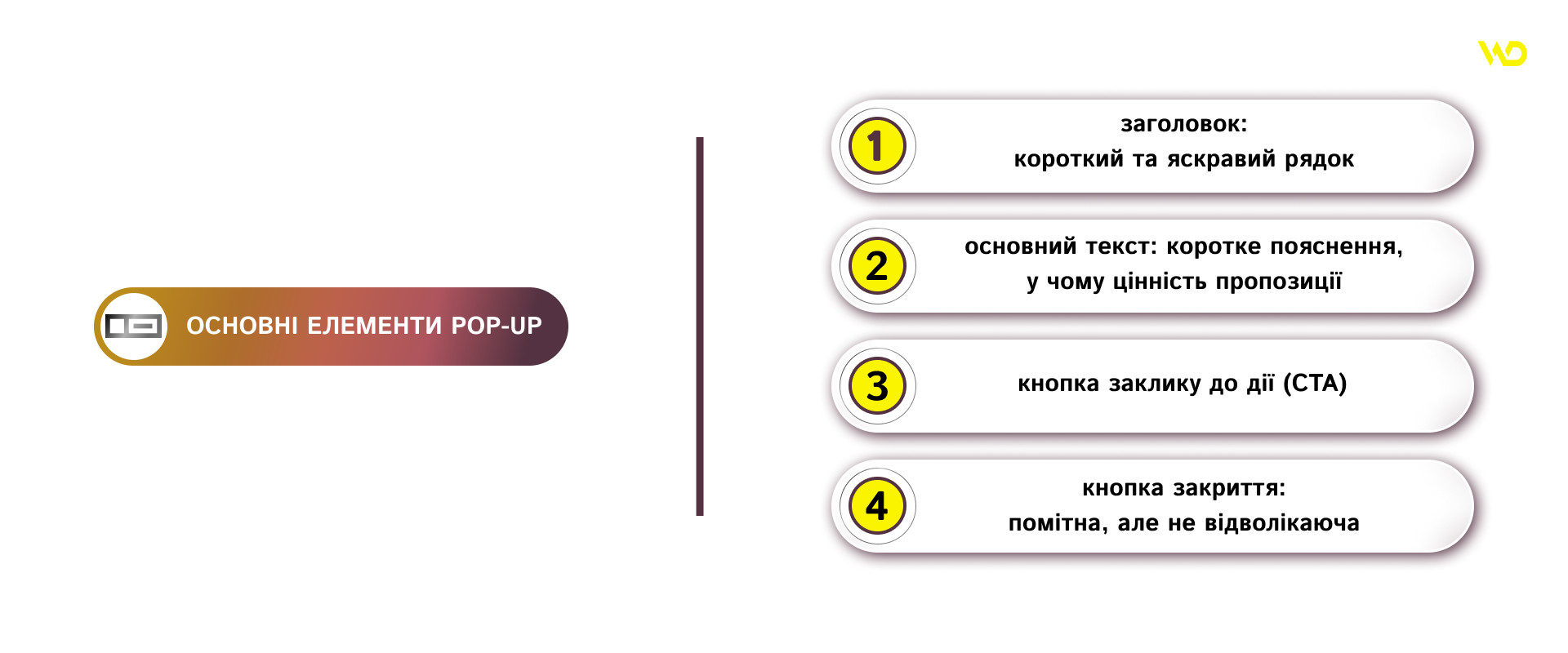
When improving the main elements of a pop-up, you should pay attention to the tone of the title and its length: optimally, 5-7 words that not only attract attention but also immediately answer the question «what do I get?». Use verbs and addresses to the reader («Discover», «Secure yourself», «Hurry up») to create a sense of direct dialog. It’s important that the headline is visually distinguished from the rest of the content – an enlarged font size, bold font, or contrasting color will help focus the eye on it without distracting from the overall perception of the page.
The next paragraph of the pop-up – the text part – serves as a soft argument. Its task is not just to list the benefits, but to build trust: indicate the validity of the offer, limit access («only today», «for the first 50 pre-orders») or add social proof («more than 2,000 businesses have already joined»). Use short sentences and avoid technical jargon, as a pop-up does not replace a detailed description on the main page, but serves as a quick call to action.
The call-to-action (CTA) button is the heart of the pop-up form, so its design and text should direct you to the action you expect. In addition to a contrasting color, you should take care of a sufficient size: the minimum size of the clickable area is 48×48 pixels. Don’t experiment too much with the text – simple words like «Get a discount», «Start now», or «Subscribe» work better than creative but unclear wording. If possible, add an element of urgency to your CTA («2 days left to the end of the promotion») or a number («save 20%») so that the user sees an immediate benefit.
It’s equally important to think about the «cross» to close the pop-up: it should be noticeable enough, but not distract from the main offer. At the same time, the closing logic can be supplemented with an alternative button such as «No, thank you» with a small print hint so that the user does not get lost. Embed minimal animation in this area to show that the element is interactive. Such little things increase the ease of interaction, and the visitor feels that their comfort has been really taken care of.
When the headline, text, CTA button, and close button work in tandem, the pop-up looks natural and trustworthy, and users are more likely to perform the targeted action.
Tips for designing a pop-up
The following basic pop-up design guidelines will help you maintain a balance between efficiency and viewing comfort for a potential customer.
Simplicity and conciseness
Pop-ups should be as clear as possible at a glance. Avoid unnecessary information, because the user should immediately see the main offer. A clear idea and clear design help to grab attention quickly.
Content relevance
The message should correspond to the topic of the page and the user’s intentions. Such pop-ups are perceived much better and convert better than those that are not related to the topic. This means that you should show different forms in different sections of the site or customize messages to the interests of the audience.
Mobile responsiveness
Given the growth of mobile traffic, pop-ups must look good on smartphones and tablets. The form should scale correctly, all elements should be easy to read and convenient to tap. If the pop-up covers the entire screen or does not display correctly on mobile, the user is unlikely to take advantage of your offer.
Unified style
The design of the pop-up should be in harmony with the overall design of the site. Use the same colors, fonts, and graphic elements as on the main pages. If the pop-up looks like a foreign object, it will alienate the visitor. A style consistent with the brand creates a sense of integrity and increases trust.
Unobtrusiveness
Even a useful message can be off-putting if it is difficult to close or if it appears too often. Provide an obvious way to close the pop-up and don’t show it unnecessarily. For example, the same form shouldn’t pop up every time you go to a new page. Find a balance between engagement and user comfort: show pop-ups only when they can be really useful.
Legal requirements
You must comply with the provisions of the Law of Ukraine «On Personal Data Protection» and the Law of Ukraine «On Electronic Communications» (regarding cookies). Add a small block to inform about the use of cookies and transparently explain the purpose of data collection:
«Our website uses cookies to improve its performance and collect statistics. By continuing to use the site, you agree to their use.»
Explicit consent to the processing of personal data is required for the correct collection of contacts via pop-up. The form must contain a checkbox with the following text:
«I agree to the processing of my personal data in accordance with the Law of Ukraine «On Personal Data Protection» for the purpose of sending information materials.»
You should not send the form without checking this box to ensure your compliance with the law.
Following these rules will help you avoid fines and loss of trust from your users, while keeping your pop-ups user-friendly and legitimate.
Testing and optimization
Pop-up customization shouldn’t be a blind guess. Use A/B testing to test different variants of the form: titles, images, colors, button texts, etc.
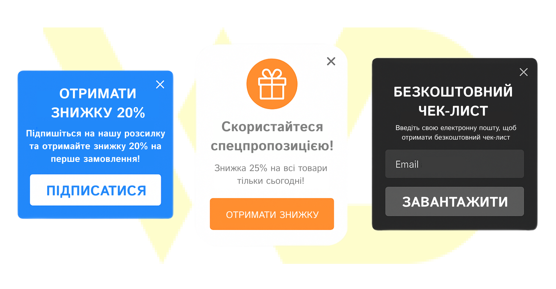
Many pop-up platforms, which we will discuss later, have built-in tools for such testing. Regular analysis and optimization help you find the most effective solutions for your audience.
By following these simple rules, you will ensure the most important thing – visitors will be more willing to interact with the form, which will ultimately increase the number of leads and sales.
Ways to create pop-up windows
There are three main approaches to creating pop-up forms – from ready-made online solutions to fully custom development. Each option has its advantages and limitations, so the choice depends on technical resources, budget, and business goals.
- Online builder services are the fastest way to create a pop-up without knowing the code. You get access to ready-made templates, a visual editor, flexible display triggers, and integrations with popular CRM, email services, and analytics. Among those worth paying attention to:
A universal tool for creating different types of pop-ups: classic, sliders, fullscreens, and sidebars. It has the logic of displaying popups based on user behavior (exit-intent, delay, scroll) and integration with more than 40 marketing platforms. Suitable for B2C and B2B businesses that want to test hypotheses quickly.
In addition to creating pop-ups, it allows you to launch polls, banners, chats, and social widgets. It offers convenient audience segmentation, conversion analytics, and responsive design for mobile devices. Its strong point is ease of use with extensive functionality.
A service with deep personalization capabilities: you can create dynamic pop-ups depending on the traffic source, page, or user interaction history. There is support for A/B testing, integration with email platforms, as well as the ability to create quizzes and segmented contact collection forms.
- Self-development (coding).
This option is suitable for those who have access to a front-end developer and want to fully control the logic, design, and technical implementation of the pop-up.
- Vanilla JavaScript or jQuery allows you to create lightweight pop-ups from scratch without any extra libraries. Suitable if you want an optimized form without third-party dependencies or have specific design and animation requirements.
- Intersection Observer API is a modern alternative to traditional scroll events. It allows you to track when a certain block (or part of the content) enters the user’s view and launch a pop-up in response. It gives you more control with less load on the browser.
- AJAX + server integration. After clicking on the CTA, the pop-up instantly sends data to the server (database, CRM, or email platform) without reloading the page. This ensures a better user experience and efficient real-time lead collection.
- Built-in CMS tools. Many website platforms have ready-made solutions for working with pop-ups. This is ideal for businesses that operate without a separate IT department.
- Popup Maker (WordPress)
One of the most popular plugins for WordPress. Allows you to create any type of pop-up with flexible display conditions (by click, time, scroll, etc.). Supports design customization and functionality extension via CSS/JS.
A powerful visual website builder that allows you to add pop-up windows through animations, interactions, or third-party integrations. It is suitable for designers and marketers who value complete freedom in visual page construction.
Ukrainian website builder with a simple editor. It also has responsive templates, the ability to add pop-up blocks, and integration with Uklon, LPgenerator, Telegram, and other services.
- Privy (Shopify)
An e-commerce tool that allows you to create pop-ups, lead capture campaigns, banners, and automated emails. It integrates well with Shopify, so it’s perfect for online stores.
When choosing a tool, take into account the specifics of your business, the required level of customization, and the available technical resources. Online services are suitable for a quick start, custom development for unique solutions, and CMS tools for easy launch without programmers. The most important thing is to test several options and choose the one that works best with your audience.


 01/09/2025
  1795
1795


