
 05/12/2024
  6970
6970

Інтернет-маркетинг
простою мовою
Content of the article
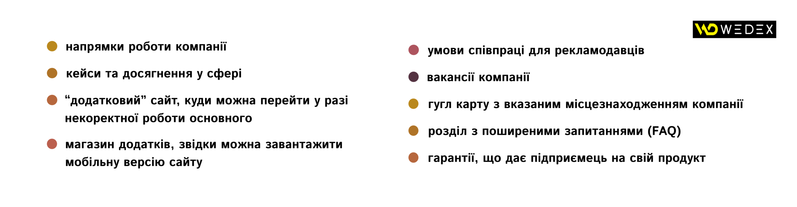
- /01 What is a footer?
- /02 The main advantages of designing the basement of the site
- /03 What is placed in the footer of the web page of the site?
- /04 What should not be in the footer?
- /05 How to competently develop the design of the basement of the site?
- /06 Key differences of online store footer
- /07 Examples of design of the basement of the site
- /08 To summarize

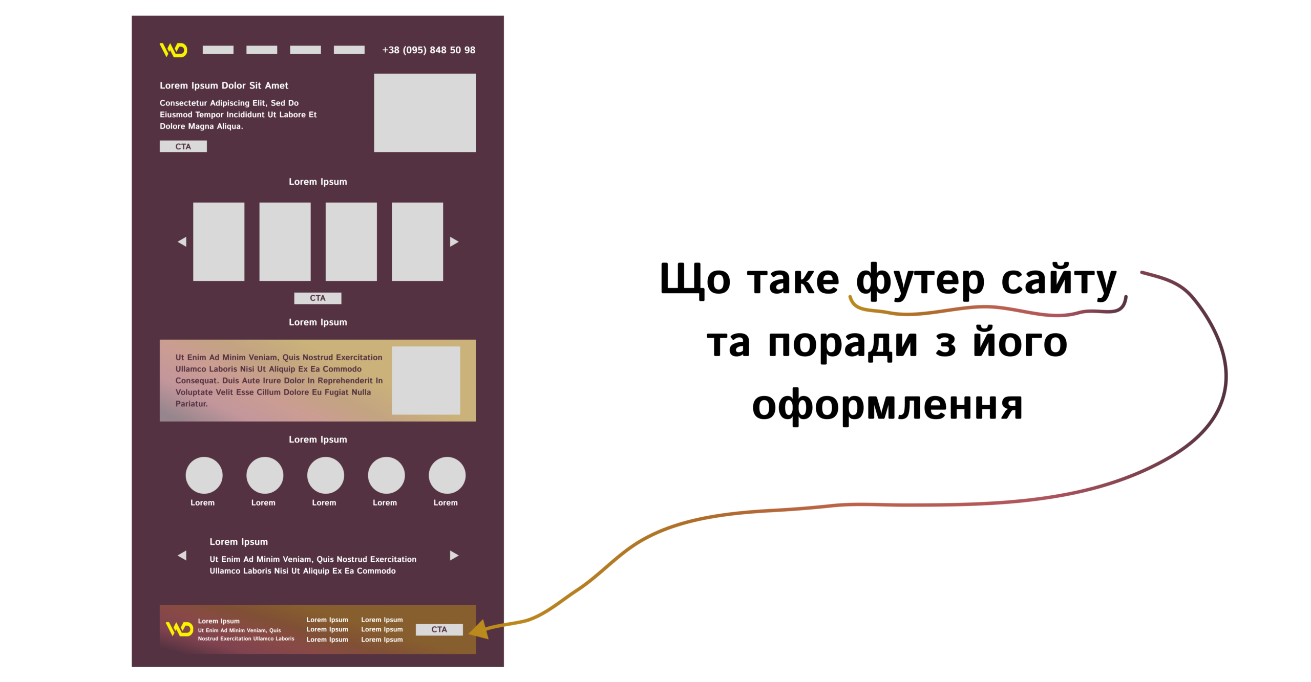
What is a website footer and tips for its design
Creating or ordering site design for your company or to promote your business, you should pay attention to every detail. The effectiveness of the resource depends on all its blocks, and the footer is no exception. Provided that it is properly designed, even such, at first glance, an unimportant part of a web resource, such as a footer, will increase the level of conversions from the site, help retain visitors and encourage targeted action.
In this article, we will analyze the features of creating the right footer, the possibilities of its design, the design rules of this block, as well as examples of effective basements.
What is a footer?
The name of the “footer” block is translated from English – footer. This element is placed at the very end and is needed for additional navigation and awareness of the potential buyer. Visually, the footer, as it is also called the footer due to its location, can be partially similar to the header (it is the menu that is located at the top of the site).
The most important is the footer for one-page sites (Landing Page), because their task is to present the product very concisely, but at the same time show the maximum benefits for the purchase.
The footer contains information that may interest users, but is not the main and most important. Among the things that are most often added to the footer are text about the company, privacy policy, clickable section titles and other information, depending on the needs of the target audience. Below we will analyze in detail all the necessary components of the basement.
Active Internet users are used to the presence of a footer on the site, so its absence can raise questions and lower the level of trust in the resource and the company. Useful footer links improve navigation and search engine ranking, so its importance cannot be overstated.
The main advantages of designing the basement of the site
Therefore, the right footer is able to hold attention and encourage action no worse than other blocks. But what else does the design of this element provide?
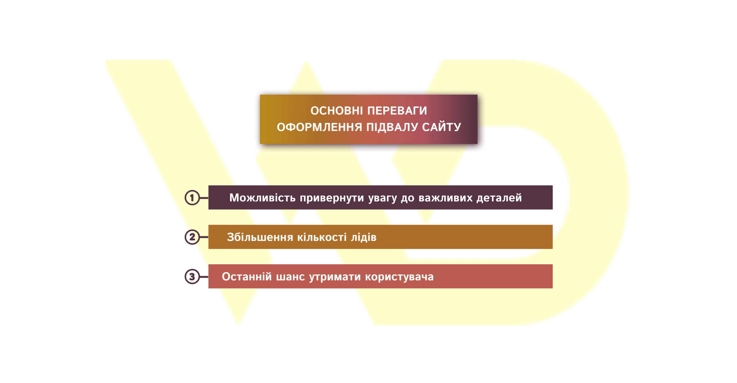
1. Ability to draw attention to important details
For example, useful information about the company’s activities, partners, achievements, cooperation rules is appropriate in this block, because voluminous texts on such subjects should not be placed in the main blocks located above. They simply will not be read, and the web resource will seem too long and boring.
Note: Many potential buyers immediately go down to the footer to find specific information that is important to them.
Therefore, the design and filling of the basement is worth a separate study by the owner and developers of the web resource.
2. Increasing the number of leads
The main task of any website is to get customers. A footer containing certain elements can improve this indicator. Even if a potential customer does not place an order, he can leave his contact details for additional consultation, subscribe to the mailing list of useful materials on the topic, register on the resource, go to the pages in the social networks convenient for him and start following the company there.
Attract even more customers!
Entrust your advertising to WEDEX professionals. Our experts will set up effective advertising campaigns that will bring new customers to you.
3. Last chance to retain the user
If the user slowly approaches the footer of the site, it means that he is still not ready to make a purchase decision and is looking for answers to questions. Therefore, navigation links and additional elements are a must have.
A competently designed basement gives the business owner another chance to “persuade” the visitor to stay and take at least one targeted action, thus getting into a pre-prepared sales funnel.
You can’t make a footer “like everyone else’s”. Always focus on the needs and pain points of your target audience when choosing block elements.
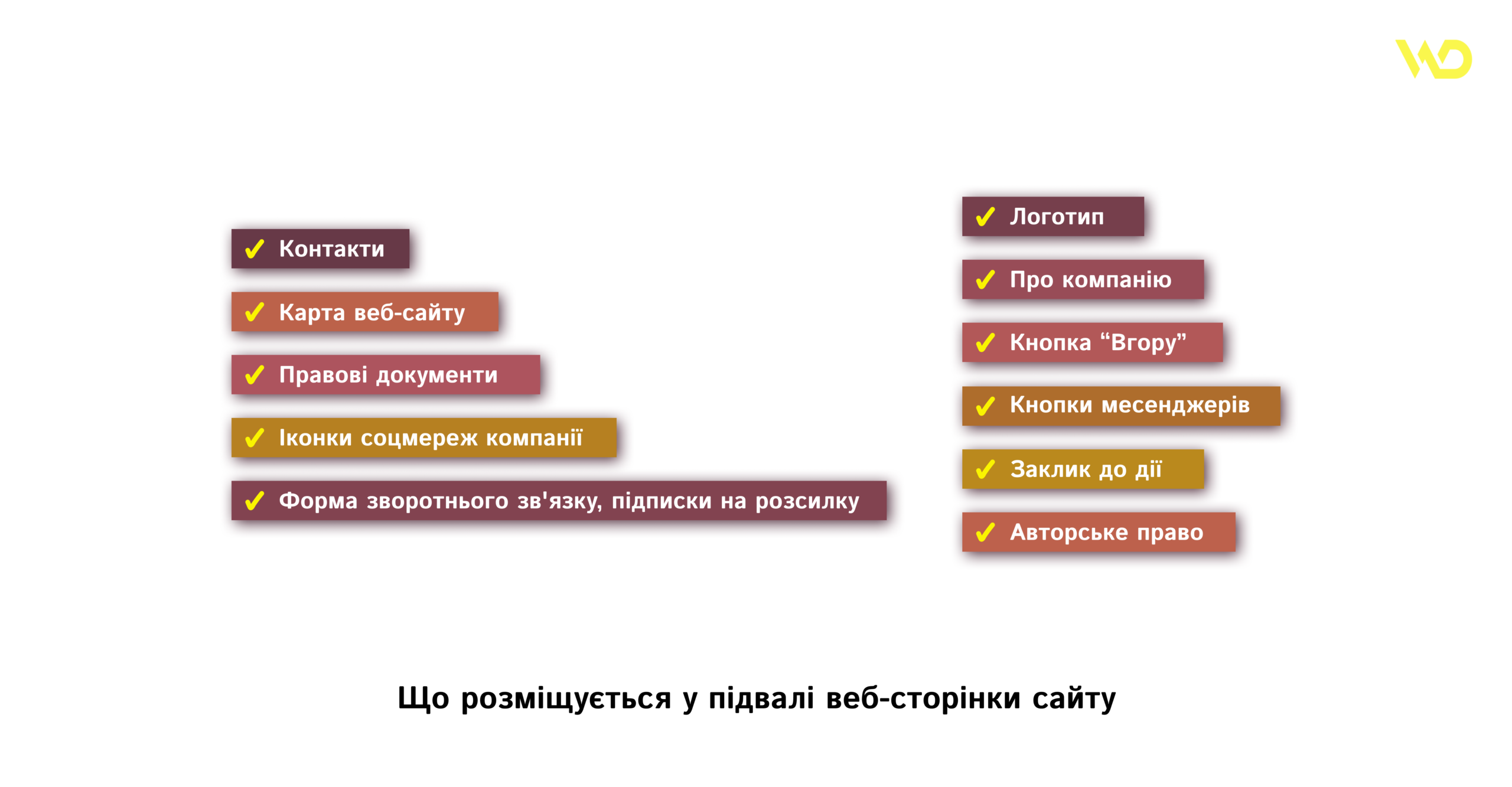
What is placed in the footer of the web page of the site?
The footer is convenient for TA because it duplicates information from the menu and is supplemented with valuable applications. Let’s consider the main and additional elements that can contain the basement of a web resource.
Basic elements for the footer
This list is certainly not mandatory, but, as a rule, using these points improves lead generation.
1. Contacts
Location of offices or stores, if you work not only online, full postal address, current e-mail of the company or sales department, phone numbers (preferably at least two, different operators), messenger buttons for quick communication using text messages. The more contact options you provide to a potential client, the higher the probability of making the first contact and, as a result, closing the deal.
2. Website map
This is a certain clickable list of pages or blocks of the entire resource. But there is a nuance here – link names must be clearly and logically structured in the form of more than a two-level hierarchy.
The most relevant is the creation of a map for projects that have a multi-level structure. For example:
section → subdivision → product
or
blog → blog section → article
It is very important to observe the hierarchy for the mobile version of the resource, because here the user first sees only a burger menu, which can gradually open deeper.
A site map is also needed to improve the position of the web resource in search engine results. Relinking is a mandatory element for SEO-optimization of the site.
3. Legal documents: privacy policy and consent to the processing of personal data
This point is mandatory if you collect any information about your potential customers on your website. Usually, each web resource contains at least one contact form, where a person specifies such personal data as a phone number or e-mail address, name and even payment data.
In the specified legal documents, the user should find information about the obligations that the entrepreneur undertakes during the collection of personal data: whether the data will be transferred to third parties, exactly how they will be used, etc.
Your footer is required by law to contain legal information, so make sure to include some space for it.
4. Clickable icons of the company’s social networks
These icons are an effective method of increasing the number of audience in those social networks, which are included in the list of tools for promoting and popularizing the brand according to your marketing strategy. It is well known that the more followers, the more trust in the account and the company. Using SMM helps establish trusting relationships with the target audience and strengthen them with existing customers.
Some entrepreneurs additionally encourage site visitors to subscribe to pages in social networks, offering bonuses, discounts, participation in prize draws, etc.
5. Feedback form, newsletter subscriptions
You can choose one thing or create a design where both forms are organically placed in the footer. They will give the interested visitor the impetus to make the first contact, and your sales department – the chance to convert the lead into a real customer, closing all the objections and pains during the consultation or in the newsletter.
6. Logotype
Placing this element in the basement of the site will strengthen the individuality of the brand and its recognition. Therefore, the logo is relevant both in the cap and in the footer. In addition, you can place a couple of words about the mission, a feature of the company, a unique selling proposition (USP) under it.
Make the logo clickable. The transition is most often to the main page, but sometimes to other sections (for example, “About the company”).
7. About the company
It is not always necessary to write a long text about the company, especially if there is no very exciting and intriguing founding story or thorny path “to the stars”. Let’s say the main thing about the company in the footer of the site, not exceeding the volume of 500 characters.
Another option is to add clickable page titles that include contacts, company history, locations (if the business operates in a certain city or cities of the country), reviews.
8. Up button
Needed to make it easier for users to interact with the web resource. Given that the footer is at the very bottom of the site, it takes a long time to scroll to the very beginning and you don’t always want to. With the help of one button, it is much more comfortable to do it.
This small detail should be:
- noticeable, however, in the general style of the resource;
- stand out on the main background of the page;
- appear starting from the second screen.
This button will improve the usability of the site, because the visitor will understand that the owner strives to do the best for the convenience of the client.
9. Messenger buttons
Today, many people choose chat instead of phone calls. Given this fact, it is worth adding clickable buttons to existing messengers and not losing a single potential customer.
10. Call to Action (CTA)
It is important to place a targeted call to action in the basement. As we have already described above, it can be a feedback form or subscription to a newsletter. Another effective way to grab a prospect’s attention is to add a “Call me back” or similar button. It is important that the call to action is clear to the visitor and clearly worded.
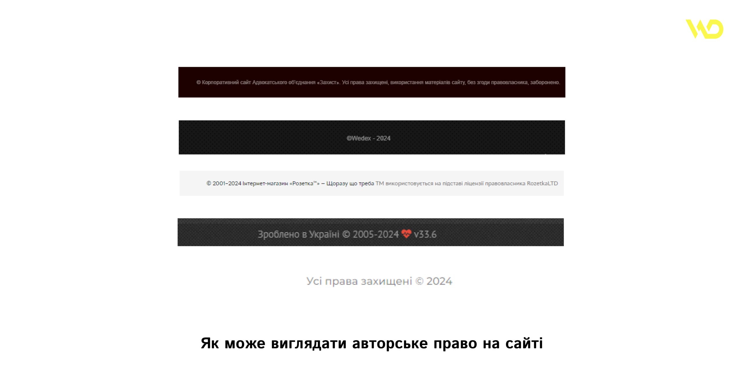
11. Copyright
Unfortunately, if someone wants to steal your content, they will. However, the copyright element is still worth adding. It can look different:
Additional elements in the footer
When you’ve added all the elements you think are necessary and useful, but still feel like something is missing, add the following links:
You can also add a language selection button, non-clickable icons of payment systems available for online payment, information about partnerships with well-known companies and participation in social projects. Sometimes the name of the site developer is indicated in the footer or even made clickable.
What should not be in the footer?
We have noted many points that can be added to the footer of the site. But it is important not to overdo it. It is not necessary to fill it all in a row so that there is no free space, because this, on the contrary, will cause the user to want to close the resource rather than find the information he needs.
To understand exactly which links and information are important to your site, ask the following questions about each element: “Will this benefit visitors to the web resource? Are they a logical continuation of navigation, categories?”. And if the answers are positive, feel free to add.
Importantly! Do not be afraid of free space in the footer. There should be a balance of usefulness and readability, so as not to spoil the impression of the entire site.
How to competently develop the design of the basement of the site?
A structured and easy-to-understand footer is a guarantee that it will actively work for you. So, there are several effective recommendations for footer design, which we will now consider in detail.
Selection of the optimal background
A very important rule is to remember that the footer is placed at the bottom of each page if the site is multi-page.
This means that the color of the basement is visually contrasting with the main background, but in a single style with the entire site. It will look organic if you choose a more saturated shade of the main color of the web resource (blue – dark blue), add only a texture or gradient as a background, or use the background of one of the blocks found above on the page. Another option is a thematic image, which will not reduce the readability of the block text.
Animation elements
Agree that any, even small, animation attracts attention much faster than a picture. Animated elements are about emotion and effective engagement.
And again we are looking for a balance. It is not necessary to hire an animator and make separate animations with characters. For example, for most resources, the smooth appearance of certain windows during scrolling, changing the color of the button under the conditions of active user actions is enough.
Importance of fonts
For the footer, you need to choose fonts that are easy to read. And to increase the effectiveness of the posted information, you should use a font size that is not too small, even if you want to fit a lot of links in the footer. It is better to review the desired content and shorten the list than to reduce the font and make it unreadable.
In addition to the size, carefully choose the color of the font. It should contrast with the background to improve reading and make you want to explore the resource further, rather than leave it.
We leave “air” in the design
It is easier to understand what the text is about when there is a lot of space around. Well-structured headings, subheadings, blocks and other elements that are visually separated by “air” help to focus on key aspects and find the right information.
It is worth noting that each site has a mobile version, which means that the amount of content in the footer should easily fit on different screens.
And again – about the call to action
Above, we noted that a mandatory element in the footer is a call to action, an attempt to keep the user’s attention and push for the first contact.
The design of the CTA in the footer is noticeable, but unobtrusive. Neither the site map nor contacts effectively help to increase conversion, namely a competently formulated and designed Call-to-Action design. This technique is time-tested and many leading companies use it on their web resources, so you should not neglect it.
Key differences of online store footer
The content and amount of information directly depends on the features and specifics of the company’s work, as well as its target audience. Landing pages and business card sites can have a minimal set of elements, but full-fledged online stores require a comprehensive approach.
The footer of the online store, in addition to the key elements that all web resources should contain, contains information about delivery and payment, guarantees and conditions for returning or exchanging goods. Of course, the basic rule of the basement remains – ease of perception and visibility.
Examples of design of the basement of the site
For a clearer understanding of the features of the website footer described above, let’s consider examples of web resources of various topics. You can use them for inspiration when creating your own footer.
Example 1: WEDEX Internet advertising agency
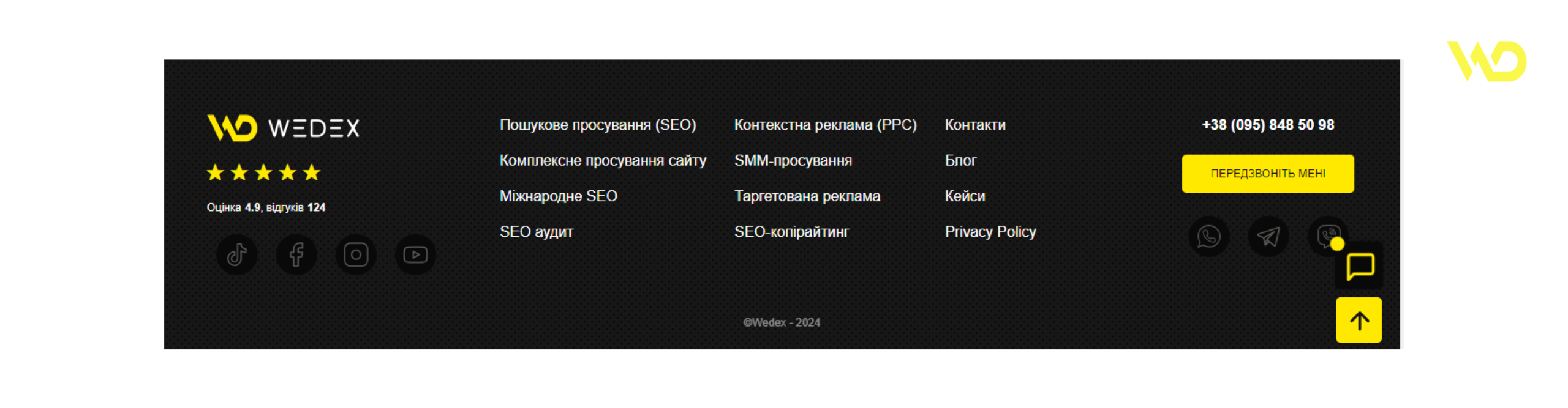
The footer has:
- a logo that improves recognition in the long run;
- evaluation of work (stars), which is calculated on the basis of received feedback from clients and adds weight to the results of the agency’s employees;
- clickable icons for popular social networks: TikTok, Facebook and Instagram, YouTube channel; it is worth noting that all of them are active, replenished with relevant information, videos and posts that are interesting and useful for the target audience;
- site map with links to all main sections;
- Privacy Policy (privacy policy);
- a clickable phone number and a clear call to action on a bright yellow button;
- clickable messenger icons for quick correspondence;
- “Up” button for even greater comfort of using the resource;
- copyright – ©.
There is a lot of information, but not too much. The entire design of the footer is thought out to the smallest detail and covers all the questions of the potential client.
Example 2: Toysi wholesale warehouse of children’s toys
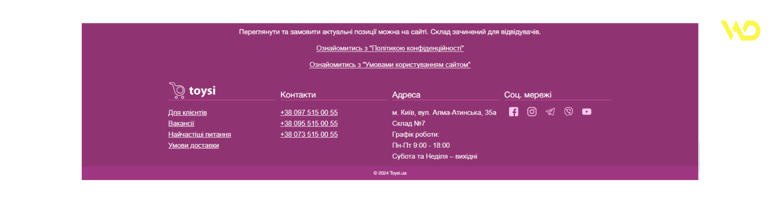
The site with products is different from the previous one. Here, in the footer design, we first see important information about the lack of physical access to the toy warehouse, legal documents. Below are phone numbers (it is convenient for the client that three operators are indicated), address, icons of social networks (Facebook, Instagram and YouTube channel), messengers (Viber, Telegram). The bottom of the site is completed by the specified copyright, which prohibits the copying of content for commercial purposes.
Note that there is a lot of “air” in the footer, so all the text and elements are perceived easily. The color solution speaks of a creative approach to the product, which is important when creating children’s goods.
Еxample 3: PIZZA DAY pizzeria
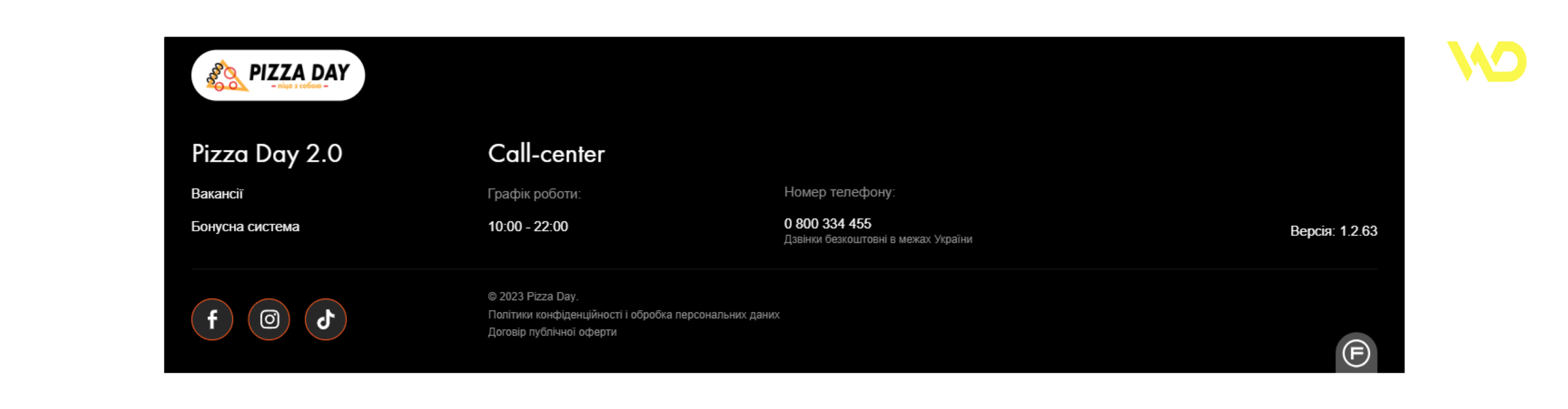
The design of the basement of the pizzeria also differs from the previous ones. They took a minimalist style as a basis and added a non-standard list of elements, which includes vacancies, a bonus system and a work schedule. This example clearly shows that the design was created depending on the principles of the company, and not according to a template.
Example 4: Milton Beauty Salon
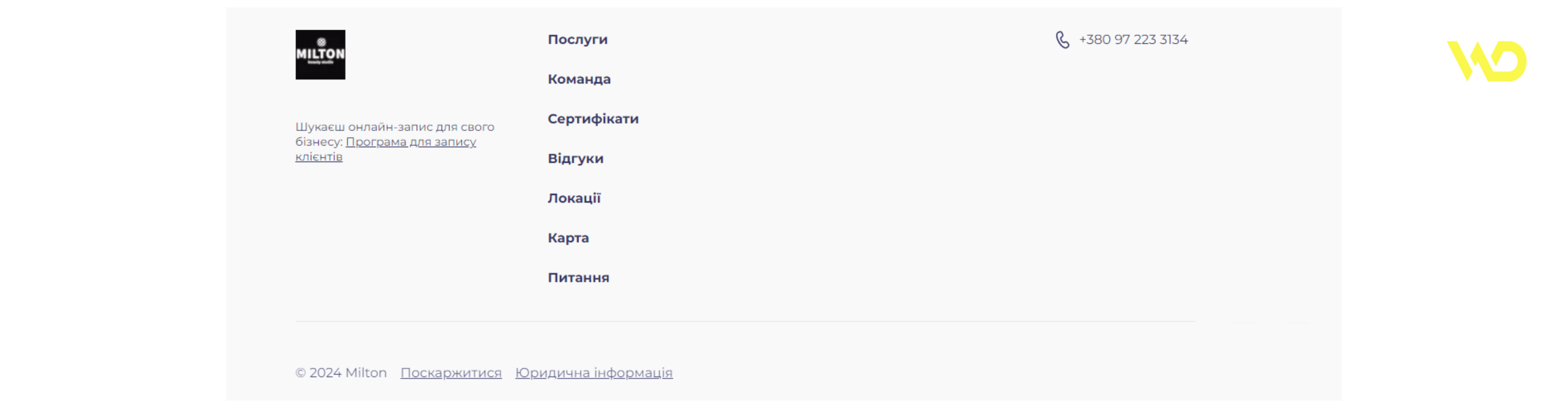
The basement of the beauty salon site is also made in minimalism. There are no bright elements except the logo. Among the interesting things is a link to the program for online registration for procedures, although it would look more interesting in the form of a button.
Customer trust is increased by the placement of the “Certificates”, “Testimonials” and “Questions” sections, and the care of new customers is demonstrated by the presence of a map and options of locations where you can make an appointment.
Example 5: Lawyer association “Defense”
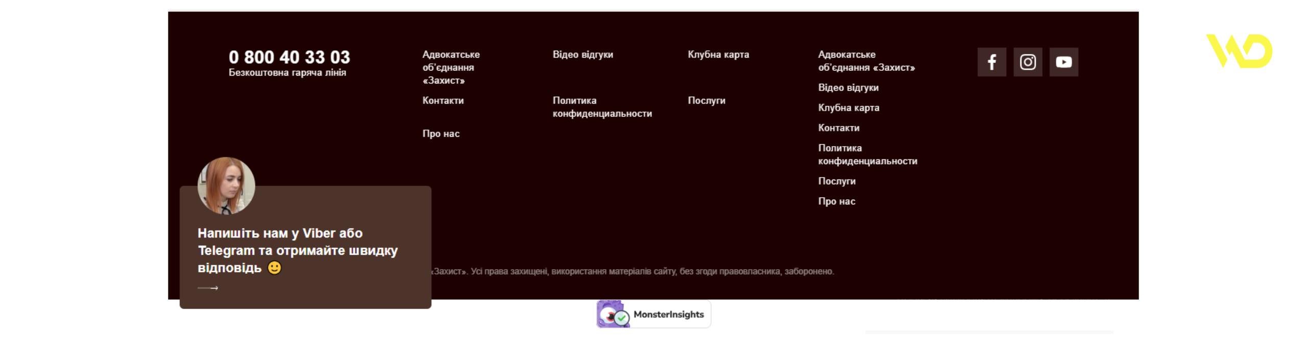
On the corporate website of the “Defense” lawyer association, we can see the possibility of contacting a free hotline. This immediately increases the loyalty of the potential client, because there are situations when such help is vitally necessary.
From the unusual – the posting of video reviews and a link to the “Club card” page, which provides for the possibility of using discount conditions and the bonus program of the bar association under certain conditions. This significantly distinguishes the resource from other similar ones.
To summarize
The footer is an important part of the site, because this block contains a lot of useful information for the user and helps to navigate the site.
A well-designed footer is able to increase conversions thanks to the presence of compactly located links to the pages that the potential customer may have been looking for. When selecting a list of elements for placement, it is important to remember the need for free space in the footer and readability of the text, then its effectiveness will be maximum.

commercial offer
Other articles by the author

13/01/2023
Search engine algorithms are constantly being improved - Google and other search engines use many factors to rank web resources. Even more parameters are considered important for website ranking by their owners. Which of them are the most important and relevant from the point of view of Google?

12/01/2026
A drop in traffic or the sudden disappearance of a website from search results can be detrimental to a business. Often, the issue is related to Google's actions, ranging from algorithmic adjustments to manual penalties (bans).

03/09/2025
Without a well-thought-out link building strategy, including proper submission to directories, even the best content will not be able to break into the top search results, and chaotic backlinks can lead to penalties from Google.
Latest articles by #SEO

23/07/2026
An RSS feed is a separate file containing a list of a website's latest posts. When a new article, news item, or other content appears on the site, information about it is automatically added to this feed.

08/07/2026
Donor analysis isn't about examining a single metric; it's about comparing several metrics against one another.

29/06/2026
If you analyze search queries correctly, you can better understand your audience, design a more precise website structure, create relevant content, and improve your SEO results without unnecessary expenses.