
 04/09/2024
  6110
6110


Інтернет-маркетинг
простою мовою
Content of the article

Mobile-First Indexing: what is it and what should website owners expect?
From June 2024, Google announced the final transition to Mobile-First Indexing, which was an important step in the development of website indexing. This decision not only affects the way of indexing, but also fundamentally changes approaches to site optimization. In this article, we are the experts agency WEDEX, we’ll look at what Mobile-First Indexing is, why it’s important, how it will affect your property, and what you can do to minimize the potential negative effects.
What is Mobile-First Indexing and why was it introduced?
Mobile-First Indexing is a process where Google uses the mobile version of your site as the primary indexing and ranking tool. This means that it is mobile content that becomes the key to determining the relevance of your site in search queries. It is important to note that if mobile version the site is missing or not optimized properly, this can negatively affect the visibility of your resource in search engines.
Why Mobile-First Indexing?
The move to Mobile-First Indexing was driven by the dramatic increase in the number of mobile users on the Internet. According to data, more than 50% of global internet traffic comes from mobile devices, making a mobile version of the site critical to a successful online presence. Google is committed to providing the best user experience, so mobile-friendly site indexing has become a priority.
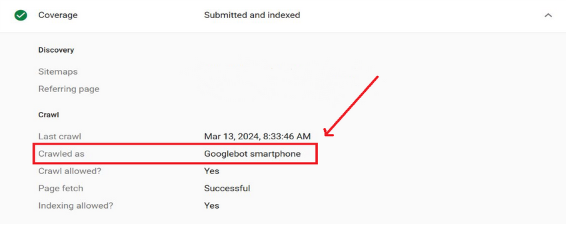
To see how your site is indexing, go to Google Search Console. Go to “Settings” where under “Information” they tell you if your website is mobile indexed.
How will this affect most web resources?
Site owners should be prepared for the fact that if the mobile version of their site is significantly different from the desktop version, this can lead to a drop in search engine rankings. However, resources where the mobile version is incomplete or significantly reduced risk significantly worsening their own ranking.
Who is at risk after implementing Mobile-First Indexing and who is not?
In the risk zone:
- Sites with poorly optimized mobile versions.
- Resources with complex navigation or heavy elements that don’t display well on mobile devices.
- Websites where the content of the mobile version is significantly different from the desktop version.
Benefit from Mobile-First Indexing:
- Responsive design sites, where the content automatically adjusts to the screen size.
- Resources that made the mobile version a priority without sacrificing content quality.
- Sites that use modern technologies to speed up loading on mobile devices.
What can be done to avoid the consequences?
Audit the mobile version of the site
Make sure that the content that mobile users see matches what is displayed on desktops. This applies to texts, images, links and structure.
To conduct an audit, you can use:
Google Search Console: monitors the indexing and visibility of the site in Google search.
Google PageSpeed Insights: Analyzes page speed and performance with recommendations for improvement.
Lighthouse (built into Google Chrome DevTools): conducts a comprehensive site audit, including performance, accessibility, SEO, and other factors, providing detailed reports for developers.
I will demonstrate on the example of the latter.
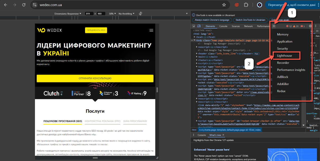
To open the Lighthouse tool in the Google Chrome browser, you need to open the Developer Panel and click on the button under the marker 1 (>>). You will see additional tools for working with the page. Select Lighthouse from the list (below marker 2).
Here’s what you can do with this tool’s features:
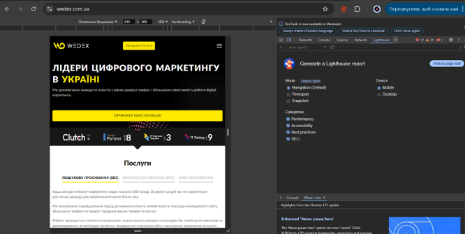
The first step is to select the mode we need for analysis, namely “Mobile”. Next, select the desired categories. Click on the “Analyze page load” button to launch Lighthouse and receive a report. After the analysis is completed, you will receive scores for each of the categories and detailed recommendations for improving the mobile version of the site. This report can be saved for future study. It will help you understand the weak points of the mobile version of your site and provide clear recommendations to eliminate them.
Let’s analyze what each criterion means and why we need it during the analysis.
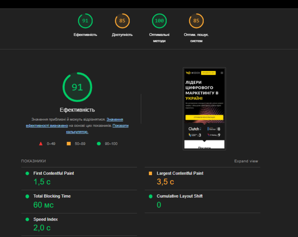
Performance: evaluates page load speed on mobile devices. If the performance score is low, you will receive specific recommendations on how to speed up the download.
Checking accessibility (Accessibility): assesses how accessible the site is to all users, including those with disabilities.
Verification of compliance with best practices (Best Practices): evaluates whether a site meets current standards for security, performance, and user experience.
SEO: evaluates how optimized your site is for search engines.
Check the download speed of the mobile version
Use tools such as Google PageSpeed Insights, to measure how fast your site loads on mobile devices. To start checking the site, enter its address in the search bar and click the “Analyze” button.
Wait for the analysis to complete. After that, a page with the result will open to you.
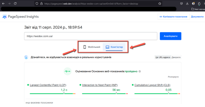
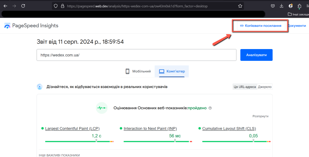
As you can see, you get analysis for two versions of the site: mobile and desktop. To switch, you just need to click on the version you need. You can also share it with colleagues by clicking on the “Copy link” button.
Here’s more about the analysis:
Largest Contentful Paint (LCP) measures the time it takes for the largest element on the page to load.
Interaction to Next Paint (INP) shows how quickly the site responds to user interaction. INP replaces the old First Input Delay (FID) metric, which did not account for the entire display update process.
Cumulative Layout Shift (CLS) displays the number of unexpected element displacements during page loading. If the elements on the page move when the user tries to interact with them, it can lead to errors and a poor user experience.
First Contentful Paint (FCP) shows when the user first sees any visual element of the page after it has been loaded.
Mobile-First Indexing means that Google primarily uses the mobile version of content for indexing and ranking. The shift from FID to INP is related to the general trend of increasing attention to the mobile experience.
Improve download speed to avoid user churn.
Optimize your navigation
Make navigation convenient and clear for mobile users. Avoid using too small elements or complex menus. Below is an example of a bad user experience.

Use responsive design
Responsive design ensures the same quality of user experience on different devices. This not only improves user experience, but also has a positive impact on SEO. To check if your site is responsive, you can simply use the Developer Panel (DevTool). To do this, press the F12 key on the keyboard. A panel will open where you can view the page code.
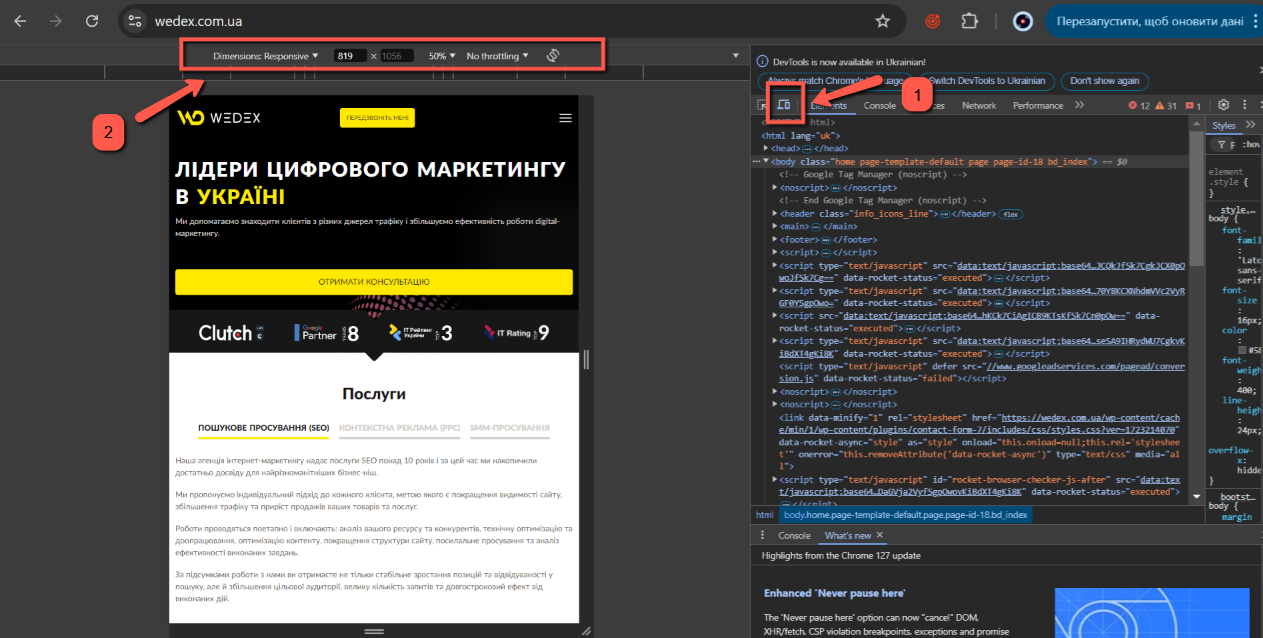
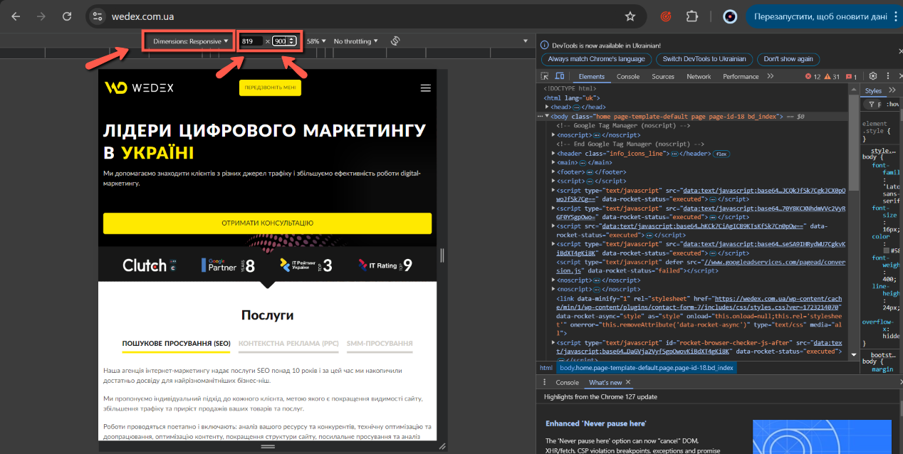
To start checking the site for adaptability, first you need to click on the icon under the marker 1. This is the transition to the screen expansion check mode. Then click on the drop-down list under marker 2. There you can choose a device to check.
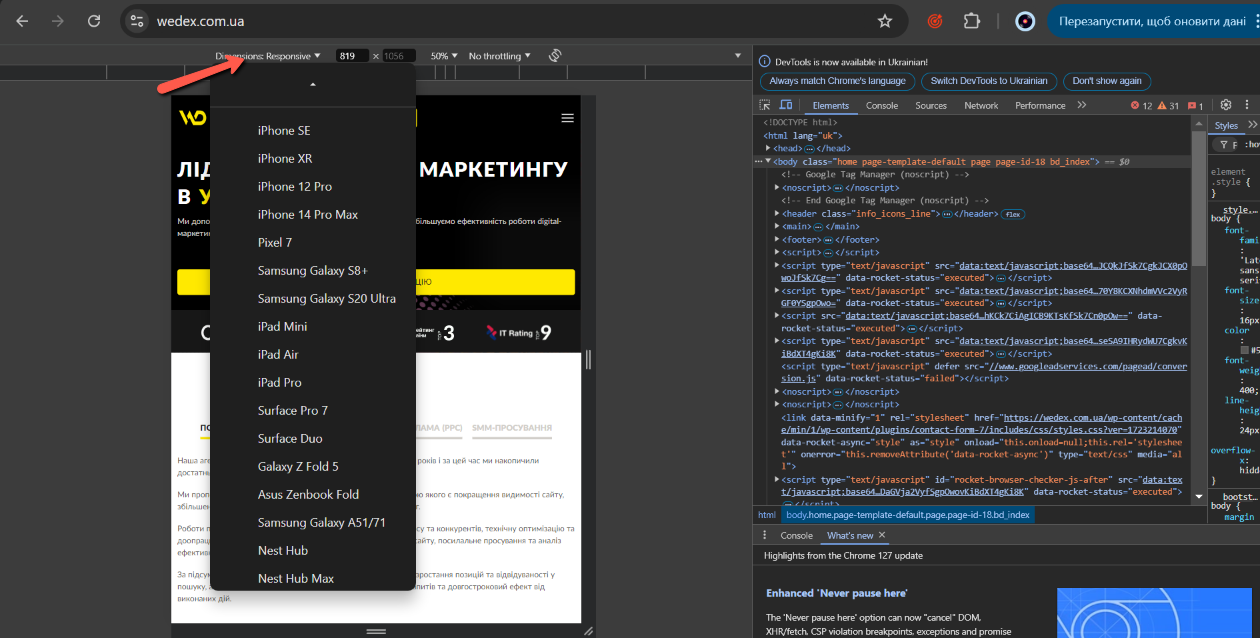
Or you can manually change the dimensions in pixels by selecting Dimensions: Responsive from the drop-down list and changing the width and length numbers in the windows.
Update content regularly
Make sure that the mobile version of the site always contains relevant information and corresponds to the latest trends.
To summarize
The transition to Mobile-First Indexing is an important step in the development of search engines, and site owners should take this factor into account when developing and maintaining their resources. A timely audit and optimization of the mobile version of the site will help avoid negative consequences and maintain or even improve positions in search queries.
If you are not confident in your abilities or do not know where to start, our WEDEX specialists are always ready to help you adapt your site to new indexing conditions. Contact us for consultation and support to ensure the stable development and success of your resource in the conditions of Mobile-First Indexing.

commercial offer
Other articles by the author

15/12/2023
An A/B test is a study that will help you choose the design option that gives the greatest number of conversions. And it is he who will help you optimize your site to get the best results. Thanks to tests, you increase page conversion; accordingly, more clients come to you, which means more profit.

26/10/2023
Search robots are the main component of the search engine and the connecting thread between the user and the published content. If a page has not been crawled and is not included in the search engine’s database, it will not appear in the search results. And then you can see it only through a direct link.

12/09/2024
Today, User Experience (UX), which means “user experience” in English, is a very common phenomenon that is relevant when developing any new product for the Internet. UX specialists are mostly found in design, but UX copywriting is also developing rapidly.
Latest articles by #SEO

15/06/2026
The algorithms of digital platforms are evolving faster than user habits, and by 2026, social media had undergone radical changes.

16/12/2025
Longread is not a format for the sake of format. For business, it is a tool for positioning, funneling, and trust.

17/06/2025
Artificial intelligence continues to transform content creation every day. That's why understanding how Google's search engine handles AI-generated content is important.